
Visual identity & website design
Qventus
Brief
Qventus helps leading hospitals and health systems optimize patient flow by utilizing machine learning and artificial intelligence, essentially simplifying how healthcare operates. This translates into exceptional outcomes for health care organizations, and greatly improved patient experiences. Qventus needed a brand refresh that would strengthen their positioning and bring more clarity to their offerings across all touchpoints.
Outcome
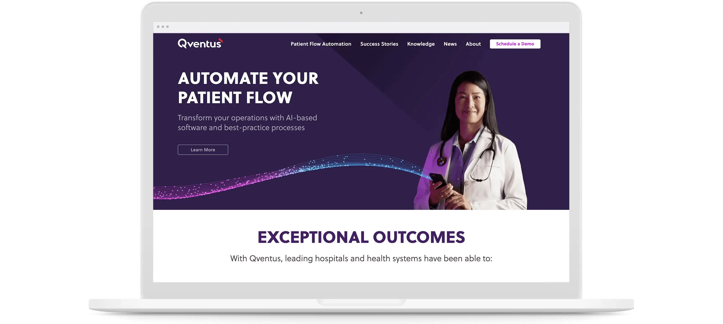
A comprehensive visual identity system was created to address all brand expressions and influence new product UI design. A dynamic branded element was also developed to represent their leadership in technology. The Artificial Intelligence “wave” lives as an animation and still image, helping to tell the Qventus story. Currently, Gilmour Craves supports the marketing and sales teams with creative for campaigns, events, presentations, and product launches.
Visual identity refresh
Website UI/UX design
Custom WordPress build
Video & photography art direction
Event identities
Iconography system
Presentation design
Digital & print production
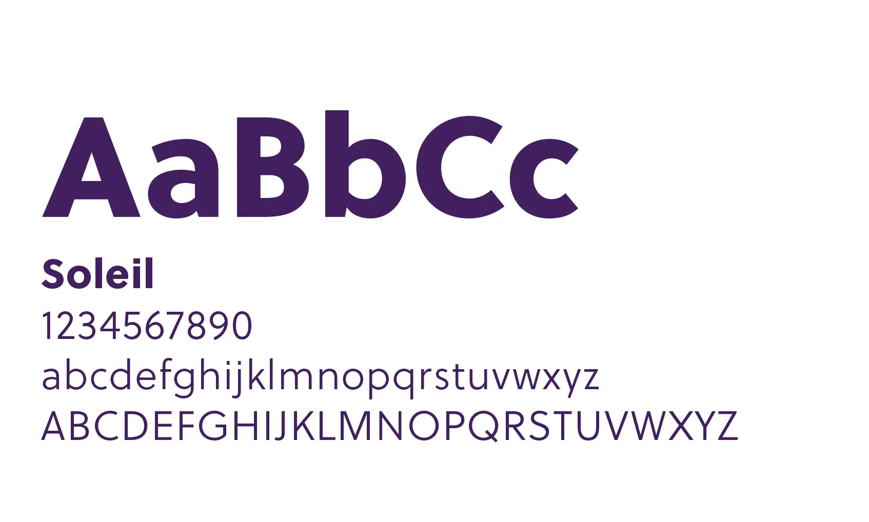
Typography
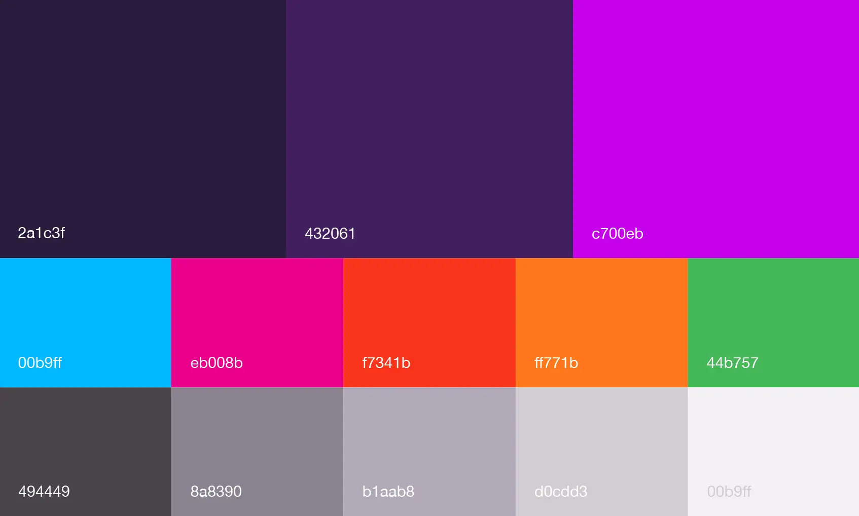
Color
Photography

ICONOGRAPHY
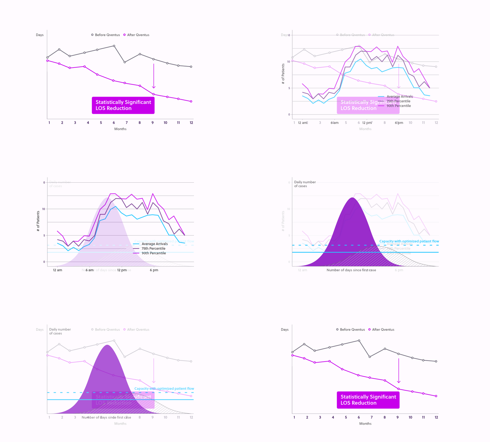
DATA VISUALIZATIONS
BRANDED ELEMENT/ANIMATION



Animated Illustration
The Qventus story is about automating patient flow to create exceptional outcomes. This story is encapsulated in the Artificial Intelligence “wave” that’s comprised of paths which represent the patient journey through the hospital. And each patient is represented by one of the dots. Patients typically experience congestion in specific areas, represented by the bright purple. Qventus alleviates this problem and helps accelerate patients on their path to discharge, represented by the blue.
It’s really high quality work, it’s bold, distinctive, and professional – exactly what we were looking to achieve when we set out with this project. We’ve worked together on a number of projects over the years, and I think this one takes the cake for both visual distinctiveness and depth of content.”
Social
©2023 Gilmour Craves. All copyrights belong to their respective holders.