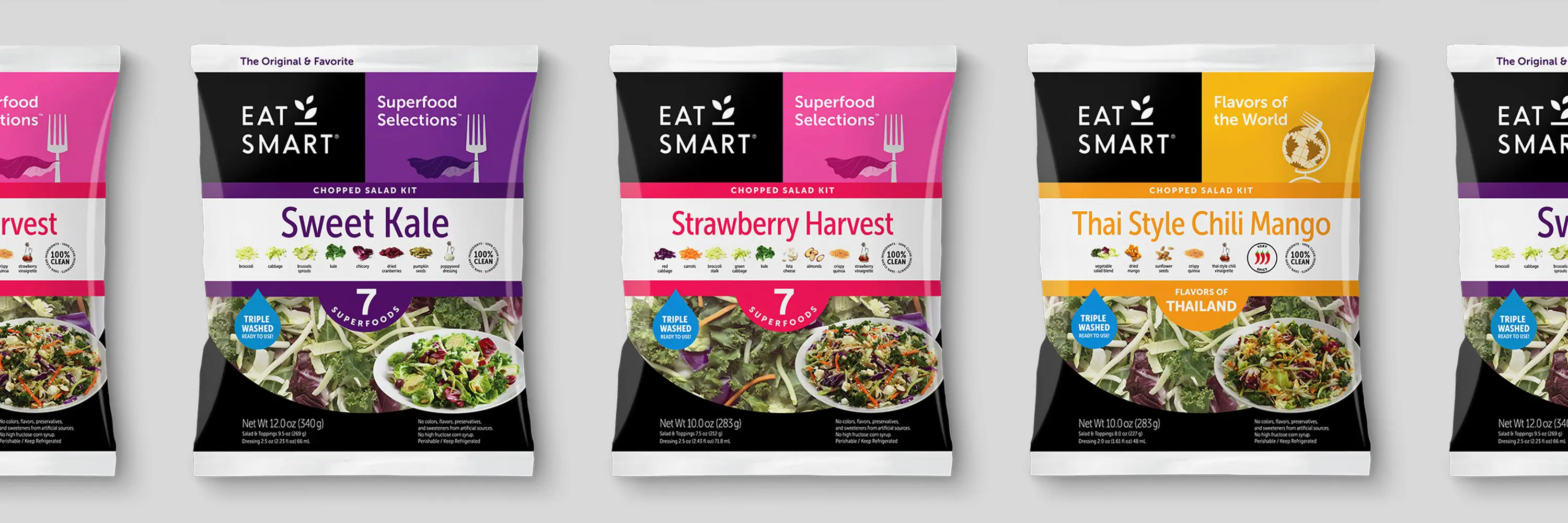
Visual identity & packaging system
Eat Smart
Brief
Eat Smart believes that the food you should eat can also be the food you want to eat. Everybody can agree that vegetables are healthy, but are they always exciting? To change this perception, Eat Smart leveraged their deep-knowledge of vegetables and other delicious ingredients to deliver meals people love. All of this was in-the-bag, unfortunately the bag did not reflect what was inside.
Outcome
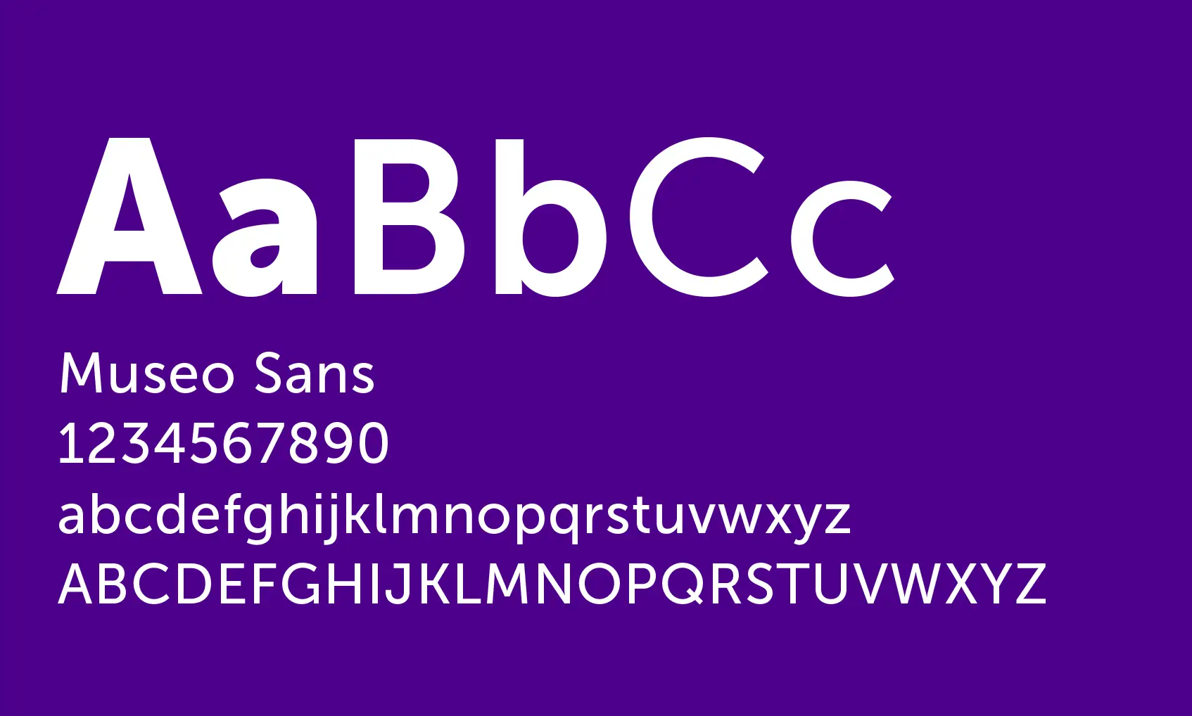
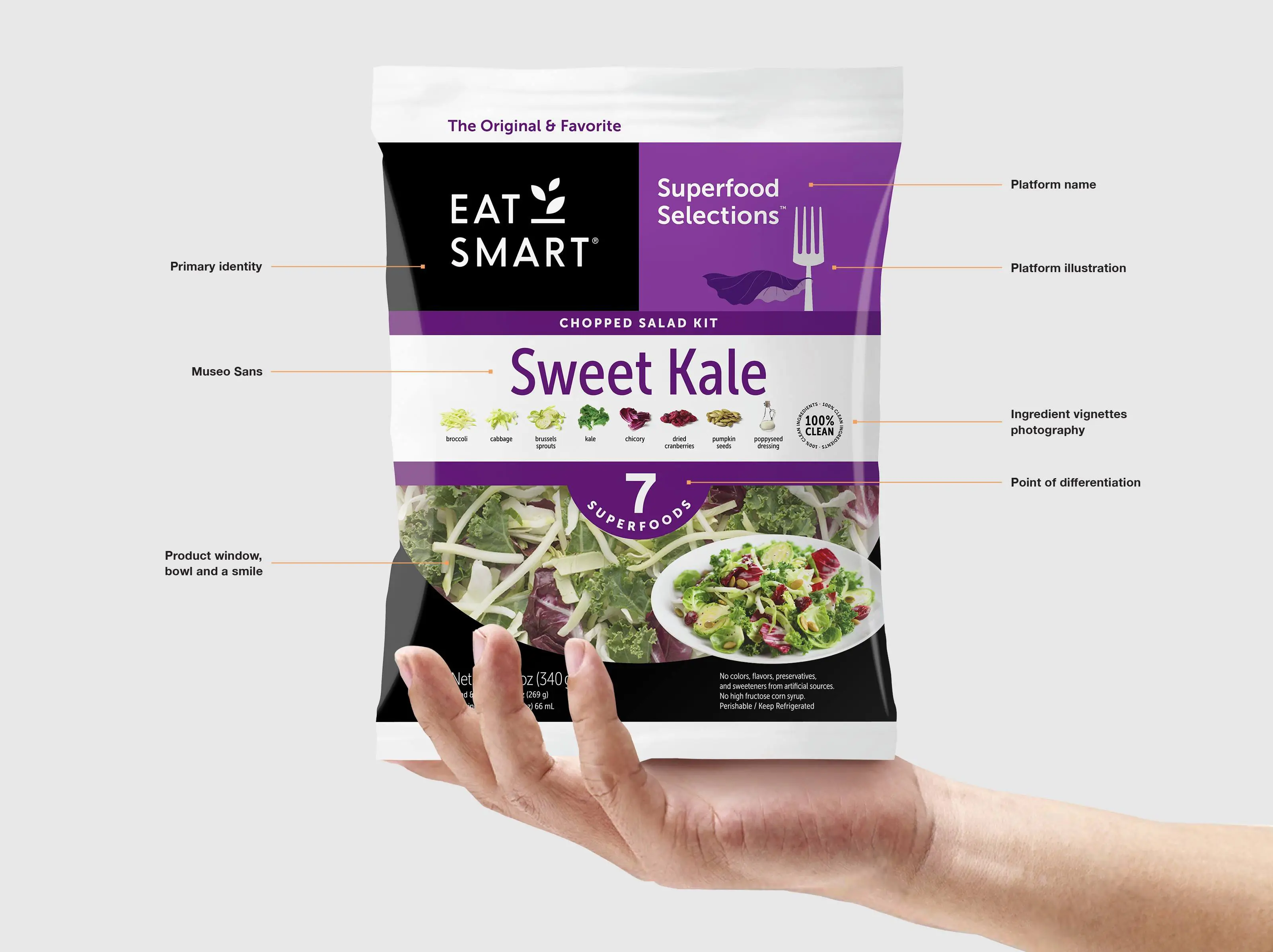
Gilmour Craves rebuilt the entire Eat Smart brand identity and package architecture from the top-down. Fundamentals included a re-imagined logotype, brand voice, typography selection, Illustration, and photography style. The end-result positions Eat Smart as a direct competitor to industry segment leader Taylor Farms.
Identity design
Brand standards
Packaging architecture and design
Point of purchase design
Social & display campaigns
Typography
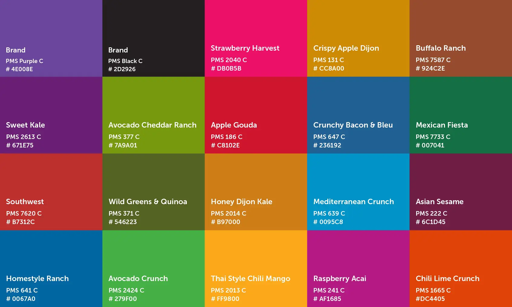
Color
Illustration

Iconography
Product photography
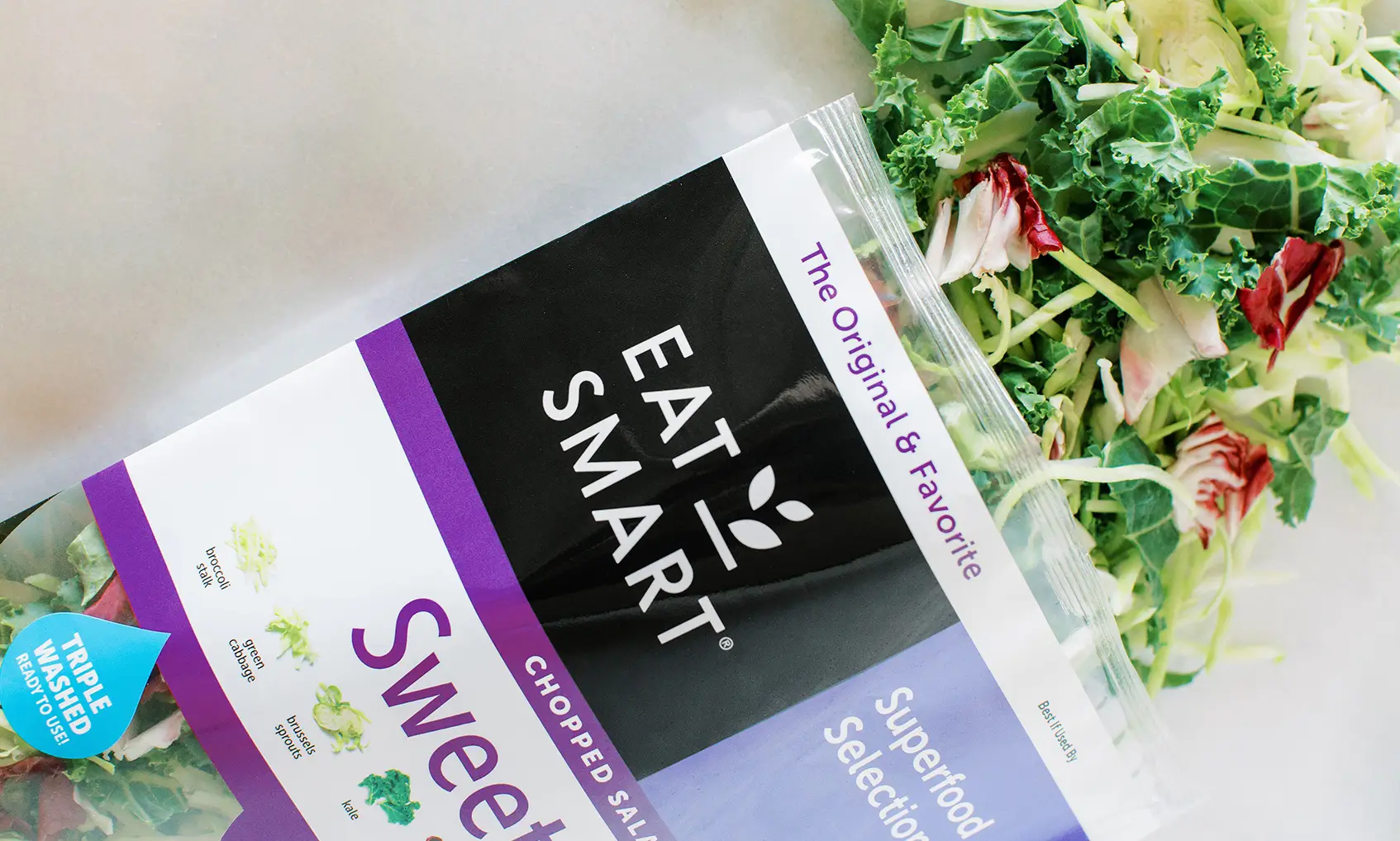
Lifestyle Photography

Social
©2023 Gilmour Craves. All copyrights belong to their respective holders.